Increase Visits & Conversions GET A FREE WEBSITE REVIEW

Blog

The Psychology Behind Effective Landing Page Design

Date: 29/09/2023

Stuart Watkins

Effective landing page design goes beyond aesthetics. It involves understanding the psychology behind user behaviour and using those best practices to create compelling experiences. This article delves into the factors that will make your landing page tick.

With the average attention span shorter than ever, capturing a user’s attention within seconds is crucial. At the top of the page, combining the right design elements to capture the visitors’ attention is vital. Utilizing a brand voice that resonates with your target audience can establish a connection that encourages them to take the desired action.

The Bedrock of Digital Marketing

Landing pages are the bedrock of digital marketing campaigns, from small businesses to enterprises. While they may appear simple, the psychology behind effective landing page design is a complex interplay of cognitive science, marketing acumen, and aesthetic sense. Let’s delve into these intricacies to provide you with a great way to craft landing pages that combine good design with excellent conversion rates.

web design agency jersey

Above-the-line content

The best landing page examples use strategic placement of persuasive copy, eye-catching visuals, and intuitive navigation to guide users towards conversion. Different ways, such as downloads or even a free trial, can be a powerful tool to convert your visitors to your online store. Knowing the best way to position key elements on the page, such as the headline, call-to-action, and trust indicators, plays a significant role in influencing behaviour.

Furthermore, understanding the emotions and motivations of your audience allows you to create landing pages that address their pain points and highlight the benefits your product or service provides. You can build trust and credibility by incorporating social proof and testimonials, further encouraging potential customers to engage.

In conclusion, designing effective landing pages requires a deep understanding of user psychology. By leveraging this knowledge, you can create landing page templates that capture attention and drive conversions.

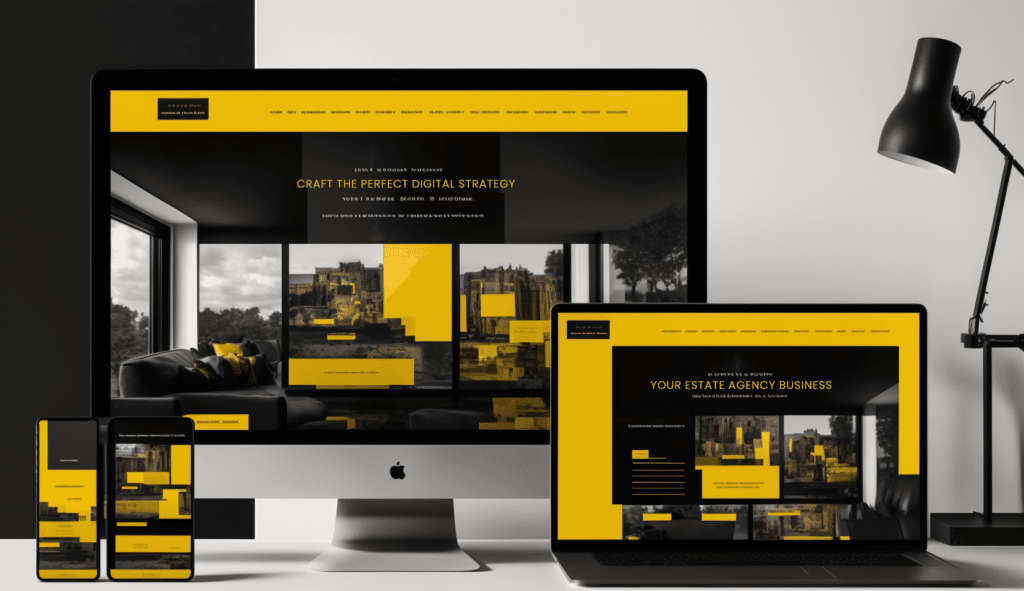
Swiss Property Landing Page Design

Importance of effective landing page design

The importance of effective landing page design cannot be overstated. With the average attention span shorter than ever, capturing a user’s attention within seconds is crucial. A well-designed landing page can make all the difference in converting a visitor into a customer.

One of the key elements of effective landing page design is utilizing a brand voice that resonates with your target audience. By speaking their language and addressing their pain points, you can establish a connection that encourages them to take specific action. Whether signing up for a newsletter, sharing on social media, purchasing, or filling out a form, a compelling brand voice can make the difference between a bounce and a conversion.

Prototypical design

Research done by Google in 2012 assessed the role of visual complexity (VC) and prototypicality (PT) re: website first impressions. The key findings were that websites with low VC and high PT were perceived as highly appealing.

This means that keeping things simple and not going too crazy and abstract with your design is the way to go. Users are comforted by familiar navigation and e-commerce sites that look like e-commerce sites.

Credit Google

The Value Proposition of Single-Page Sites

Single-page sites have emerged as a powerful alternative to traditional multi-page websites, especially in the context of landing pages designed for targeted marketing campaigns. The inherent simplicity and focused nature of single-page sites align perfectly with the core objectives of any landing page: to convey a singular message and drive users towards a specific action.

Enhanced User Engagement

Without needing to click through multiple pages, users find engaging with the content presented easier. Everything they need to decide is laid out linearly in single pages, reducing decision fatigue.

Streamlined Design

The absence of multiple pages allows for a streamlined, clutter-free design. This content concentration enhances the visual hierarchy, making key elements more prominent and persuasive.

Fast Load Times

Fewer pages mean fewer elements to load, contributing to quicker load times. Given that a single-second delay can significantly impact conversion rates, the speed advantage of single-page sites is not to be underestimated. Users and search engines equally appreciate faster load times.

Easier Analytics Tracking

With just one page to monitor, analytics become far less complex. You can easily track user interaction from top to bottom, gathering insightful data to refine your landing page strategy further.

The single-page format for landing pages offers numerous advantages that amplify user engagement and facilitate conversion. By simplifying design elements and focusing on a singular message, single-page sites provide an ideal platform to achieve your marketing objectives with laser-like precision.

Understanding your visitor’s needs

To design an effective web page, it’s essential to understand your website visitors’ psychology. What motivates new customers? What emotions do they associate with your product or service? By understanding these factors, you can create landing pages that address their pain points and highlight the benefits of your product or service.

Key principles of effective landing page design

When designing your landing pages, there are several fundamental principles to remember. The first is the strategic placement of persuasive copy. Your headline should be attention-grabbing and communicate the value proposition of your offer. The body copy should highlight the benefits and features of your product or service while addressing any objections or concerns the user may have.

In addition to persuasive copy, eye-catching visuals are crucial in capturing and maintaining user attention. High-quality images, videos, and graphics can help communicate your message and create a visually appealing experience. However, balancing aesthetics and page load speed is essential, as slow-loading pages can lead to high bounce rates.

Another key principle of effective landing page design is intuitive navigation. Users should be able to easily find what they’re looking for and navigate through the page without confusion. Clear and concise navigation menus, breadcrumbs, and well-placed internal links can help guide users towards conversion.

Understanding the Cognitive Biases

Cognitive biases like the Anchoring and Halo Effect greatly influence user behaviour. Employ these biases to guide users towards specific actions, such as clicking a CTA button or completing a form. For instance, placing a high-value offer near a less attractive one utilises the Anchoring Effect to make the latter seem more appealing.

Cognitive Biases

Leveraging Simple Contact Forms Connected to CRM for Optimal Engagement

The contact form is one of the most effective yet often overlooked elements on a landing page. But not just any form—ideally, a simple, straightforward one that is directly connected to your Customer Relationship Management (CRM) system. Carefully consider the fields, less is usually more, do you need more than an email address or a phone number to start a dialogue?

By embedding a contact form within the landing page itself, you eliminate the extra step users have to take to reach out. This ease of interaction significantly boosts conversion rates. Moreover, when this form is linked to your CRM, you enable an automated flow of data that can be immediately acted upon. This seamless integration allows for real-time lead capture and nurturing, making your follow-up processes far more efficient and timely.

Neuromarketing Techniques for Landing Page Success

Incorporate neuromarketing principles such as the ‘paradox of choice’ to simplify decision-making for the user. Offering fewer but more targeted options can lead to higher conversion rates.

Improving Conversions with Textual Cues

Textual cues can guide users toward conversion goals. Microcopy like “Limited Offer” or “Only X Left” can instil a sense of urgency and exclusivity, nudging the user to act quickly.

Best Practices for Navigation: Balancing Simplicity and Direction

Effective navigation is more than just a utility; it’s a guiding hand that can usher users toward conversion or lead them astray. The best landing page navigation strikes a balance between simplicity and direction. Here are the key considerations:

Minimalism is King

The more options presented, the harder the decision-making process. Keep your navigation bar limited to essential items contributing to the conversion goal.

Prioritize Direction Over Discovery

Unlike a traditional website, a landing page aims for a single conversion goal. Thus, any navigation elements should focus on guiding users toward that end, rather than encouraging aimless exploration.

Sticky Navigation Bars

Utilize sticky navigation bars that remain visible as users scroll down the page. This keeps key options within reach, reducing friction and encouraging action.

Include ‘Anchor’ Points

If your landing page is long and filled with various sections, use anchor points in your navigation to quickly jump users to key conversion points. This enhances usability and minimizes scrolling fatigue.


The Imperative of Social Proof on Landing Pages

Social proof acts as a psychological catalyst that propels users toward conversion. It comes in various forms—customer testimonials, star ratings, or the number of product downloads, to name a few—and alleviates the anxiety associated with decision-making. The underlying principle here is conformity; people are more likely to take action when they see others have done the same.

By strategically integrating social proof elements on your landing page, you capitalize on the user’s inherent need for validation. Whether showcasing customer testimonials near the CTA or displaying the number of successful transactions, social proof reinforces the credibility and value of your offer.

Social Proof Examples

Colour scheme and emotions in landing page design

Colours play a significant role in evoking emotions and influencing user behaviour on landing pages. Different colours have different psychological associations. For example, blue is often associated with trust and security, while red can evoke a sense of urgency. Using colours strategically allows you to create a visual experience that aligns with your brand and resonates with your target audience.

In addition to colours, typography and readability are important factors in landing page design. The choice of fonts, font sizes, and line spacing can impact how easily users can read and comprehend your message. It’s important to choose legible fonts on both desktop and mobile devices and to ensure enough contrast between the text and background for optimal readability.

Typography and readability on landing pages

Visual hierarchy refers to arranging and prioritising elements on a landing page. You can guide users’ attention and influence their behaviour by strategically positioning key elements such as headlines, subheadings, images, and calls to action. The most important elements should be placed prominently and attractively, while less essential features can be positioned further down the page.

In addition to visual hierarchy, attention is a crucial factor in landing page design. Users have limited attention spans, so capturing their attention within seconds is important. Eye-catching visuals, compelling headlines, and clear calls-to-action can help grab and maintain user attention, increasing the likelihood of conversion.

Visual hierarchy and attention on landing pages

The call-to-action (CTA) is arguably the most important element of a landing page. It’s the gateway to conversion and should be designed to be highly visible and compelling. The CTA should communicate the desired action and use persuasive language to encourage users to take that action.

A well-designed CTA button should stand out from the rest of the page, using colour, size, and placement to draw attention. It’s also important to use action-oriented language, such as “Buy Now,” “Sign Up,” or “Get Started,” to create a sense of urgency and encourage immediate action.

Visual Hierarchy and its Psychological Impact

Visual hierarchy is not just about what looks good but also how it subconsciously guides the eye. Use Z-patterns or F-patterns to structure elements to match natural eye movements. This will make key elements like your CTA, headlines, and key benefits stand out.

Call-to-action (CTA) optimization on landing pages

Designing an effective landing page is an ongoing process of improvement. A/B testing is a valuable tool for optimizing your landing page for maximum conversion rates. By creating multiple versions of your landing page and testing different elements such as headlines, visuals, and CTAs, you can gather data and insights to inform your design decisions.

Conversion rate optimization (CRO) involves analyzing data and making data-driven changes to improve the performance of your landing page. By tracking user behaviour, conducting user surveys, and analyzing conversion data, you can identify areas for improvement and make iterative changes to optimize your landing page for better results.

User Experience and Load Time

A landing page must load within 2-3 seconds to engage the user. Any delay can increase the bounce rate exponentially, negating all other psychological tricks.

A/B testing and conversion rate optimization for landing pages

In conclusion, designing effective landing pages requires a deep understanding of user psychology. By leveraging this knowledge, you can create experiences that capture attention and drive conversions. You can create landing pages that inspire action by utilizing a brand voice that resonates, addressing user pain points, and strategically placing persuasive elements. Remember to continuously test, analyze, and optimize your landing pages to ensure maximum conversion rates.

Conclusion: Applying psychology to create high-converting landing pages

With the average attention span shorter than ever, capturing a user’s attention within seconds is crucial. Utilizing a brand voice that resonates with your target audience can establish a connection that encourages them to take the desired action.

Using language and visuals that align with your brand’s identity and values is important when designing a landing page. This helps create a consistent user experience and allows users to recognize and connect with your brand quickly. Whether through bold headlines, compelling imagery, or engaging video content, every element on the page should be intentionally designed to capture attention and keep users engaged.

Share this Article share

Tell us about
your project

Send us a brief message outlining
your project and we’ll get back to
you asap to discuss your project
in more detail.